Duration:
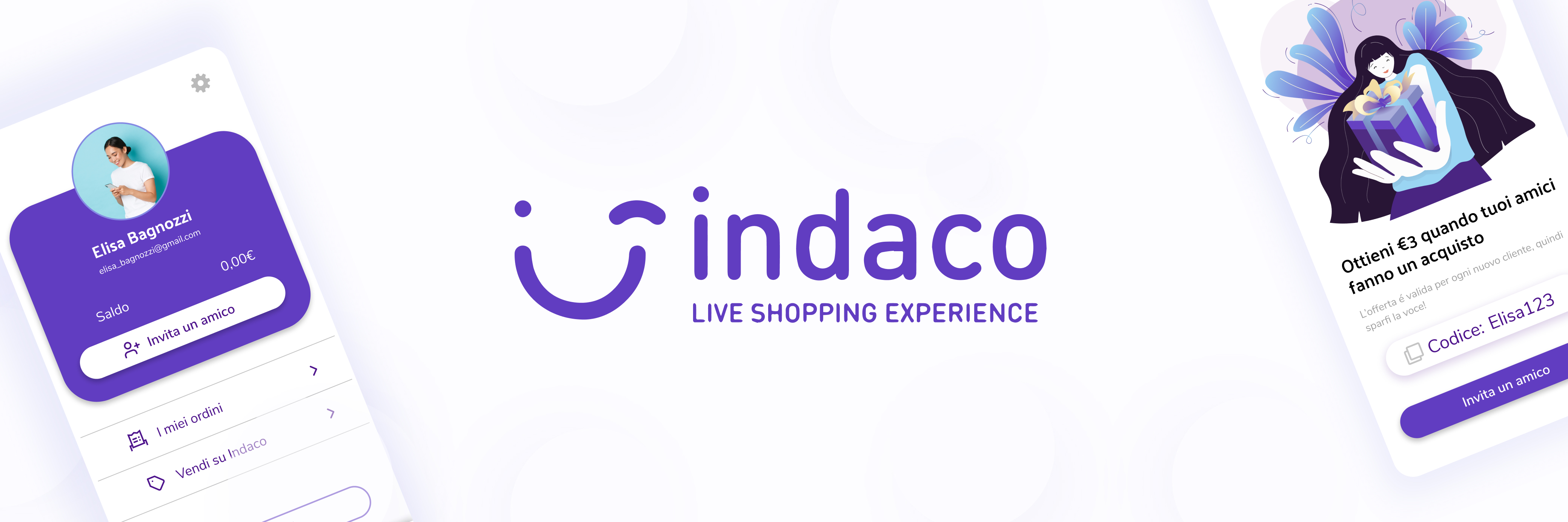
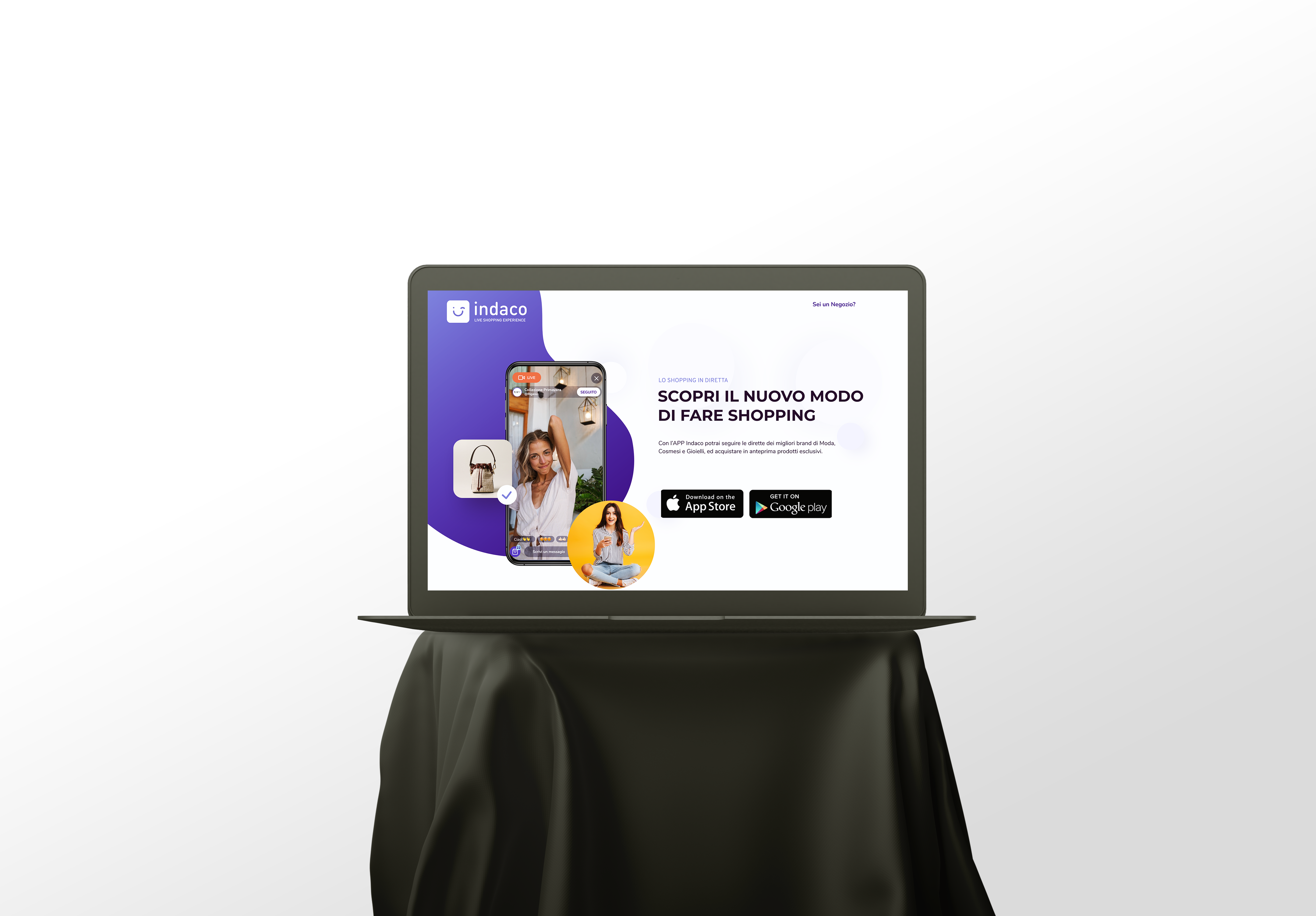
Indaco App
2021 March/April
Project:
Tools:
Branding, Ux /UI, Web design
Figma, Miro, Illustrator, Photoshop, WordPress(Elementor)
My Role:
Project vision
Indaco is the first European marketplace app for live streaming shopping. A turnkey solution for managing, promoting, and selling products, and interact with customers everything in one single app. A dedicated network for live streaming shopping with a focus on fashion, cosmetics, and accessories.
Challenges
- Design a cohesive interface for familiar and unfamiliar users
- Create a minimalistic UI while keeping products as the focus
- Provide a seamless & linear purchasing experience
Kickoff
When I had started to work on this project, the app was already launched. So first of all I had to understand the app and the brand, identify the problems and the points where we could enhance user experience with the app.
Goal
With minimum time&budget enhancing user interaction, finding intuitive design solutions with consistent brand identity.
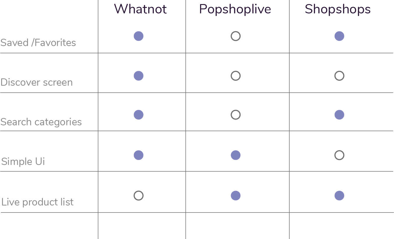
Competitor Analysis
In order to construct a concise and solid foundation for Indaco, I had to venture out and see what the prominent live shopping applications were already doing and what user goals they were not reaching.
I evaluated several features deemed vital from user surveys and identified which ones Indaco could capitalize on to have a leg up over other applications.
I found that only two of the three main competitors offered saved products/favorites as a list to the users.
Needs & Values for User
Going deeper on understanding the user, we need to categorize the types of needs and the values we add for the user throughout the app.
Varl%u0131k%2016.svgSearch for something known
Looking for inspiration
Extensive research
Re-finding
The must have features:
- Advanced filters
- Suggested products
- Auto suggestion for search feature
- History/Favorites
User testing & observations
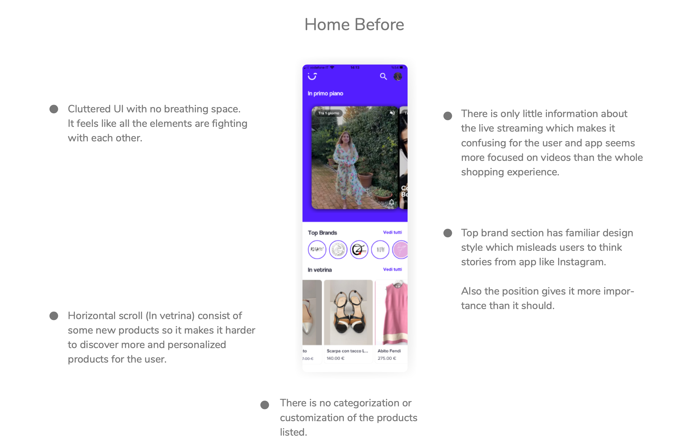
The users that I had observed, had difficulties spending time on the app. They could find only few products on the app, which led them to think there wasn’t any reason to stick around. One of the user couldn’t find the details of the order that he just did. These observations have led me to these three pain points.
#1
#1
Poor navigation
Absence of a menu offers poor navigation to the users. Navigation among the screens are not seam- less.
#2
Lack of simple, intuitive interface
Color choices are very intense for the eyes. Lack of consistency for the design elements throughout the app and the brand identity.
#3
Poor shopping experience
Home screen has live streamings and limited product categories, which does not interact with the user in order to create better shopping experience.

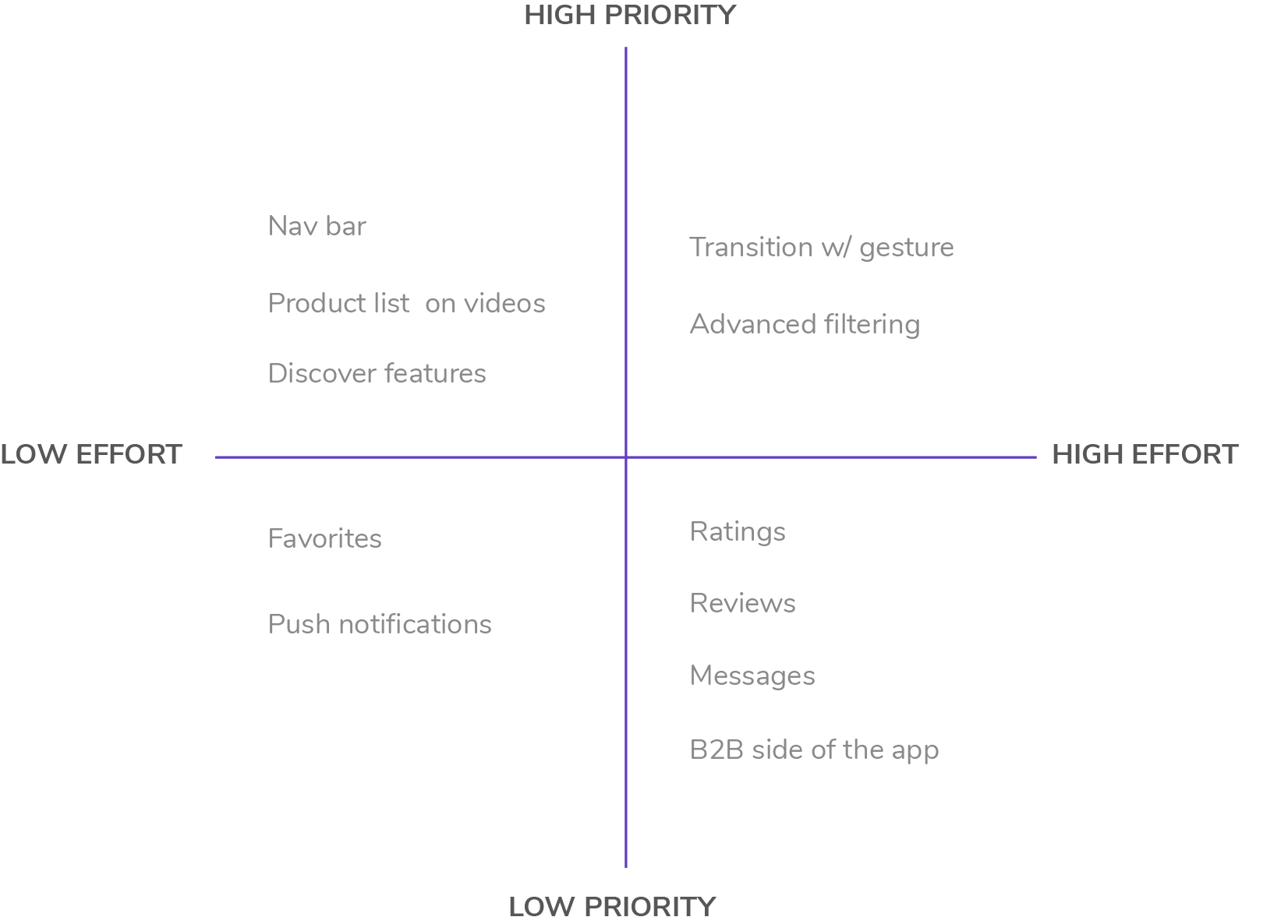
Prioritization Plotting
Plotting down a list helped me to narrow down what was crucial and what was urgent in order to have most effective changes for the app.
The only thing that we have to keep in mind is that this application is solely for shopping, so in order to enhance the user experience, first we need to build a shopping experience which is lost at the moment. All the leading features of the app are for live streams, not for shopping itself.
Building Persona

Clara Rossi
AGE: 27
HOMETOWN: Rome
OCCUPATION: Hairstylist
FAMILY: Single
“Shopping is my cardio”
Frustrations
- She loves online shopping but she had bad experiences in the past so she has trust issues regarding new brands that she doesn’t know.
- Also sometimes the goods don’t match the description.
Habits
She is very active on social media and she enjoys buying new items from instagram live because she can see directly the seller and the product on use. Also she can send message and talk directly to the seller.
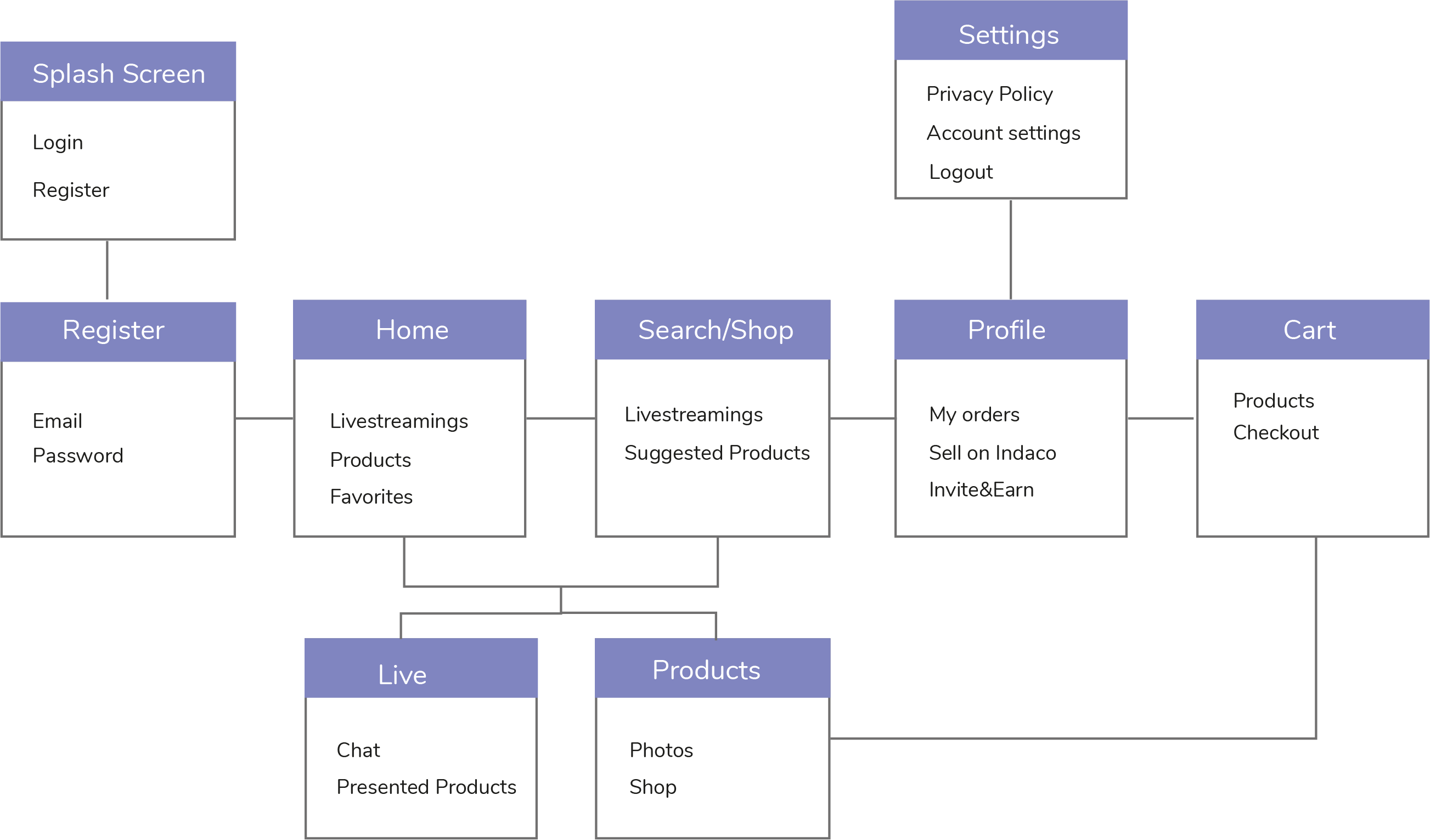
Information Architecture
Style Guide
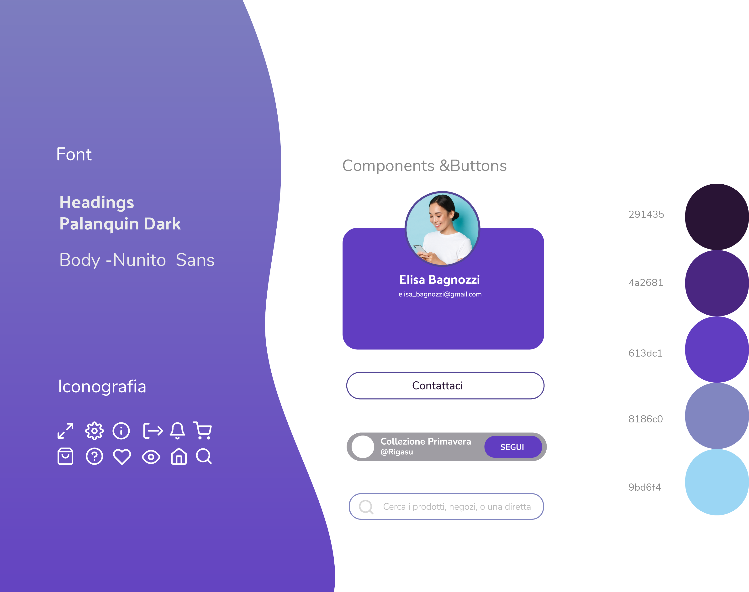
The first thing I had to change was the color scheme without changing too much of the brand identity. I chose organic shapes and curved rectangles.
The main typeface of choice for the app is Nunito Sans. For headings on the Web site we have used Palanquin Dark.
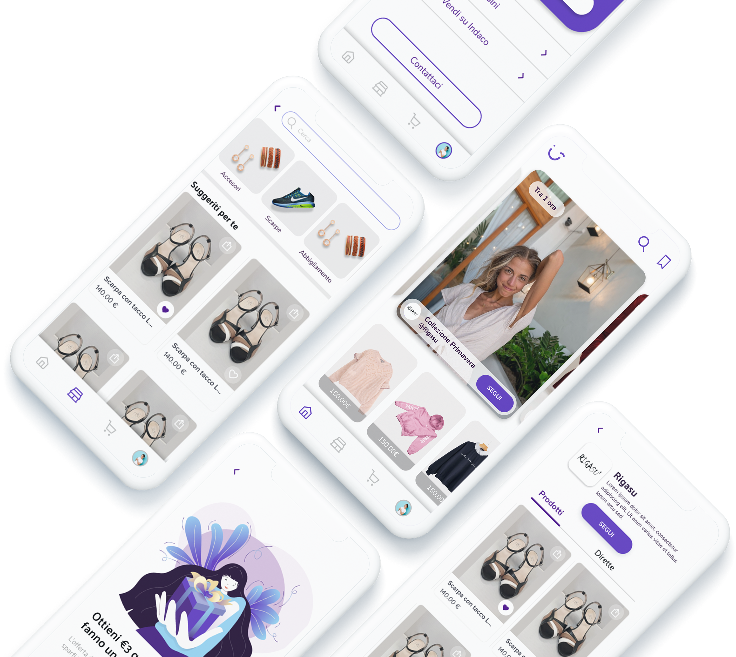
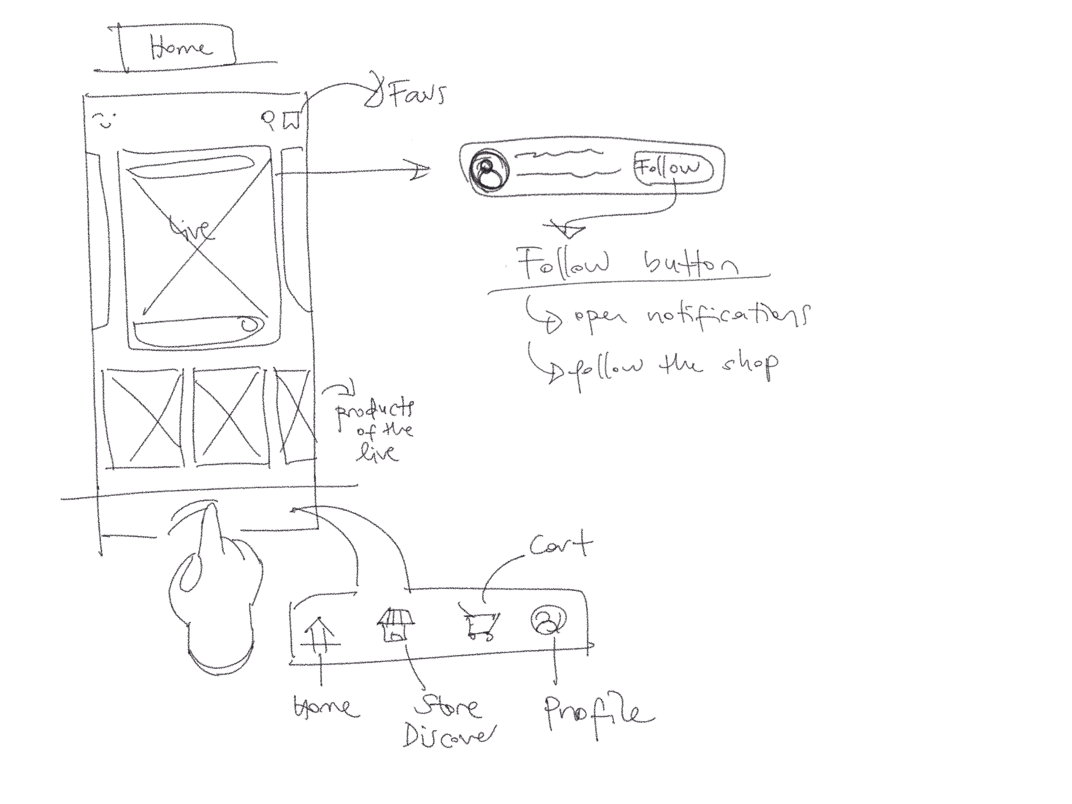
Home After


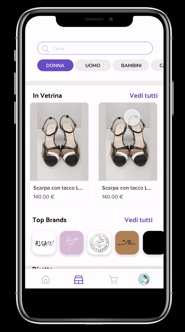
Store & Search Feature
I have created a new screen in order to offer extensive research to the user. For the store screen, I have selected 4 main categories to have personalized results and seamless searching experience.
For the extensive search I have added categories with visuals which make them more interactive and create a desire to try and see more categories. This feature also can be used to add tags, theme categories like”Halloween” in the future.
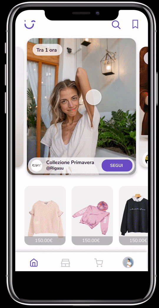
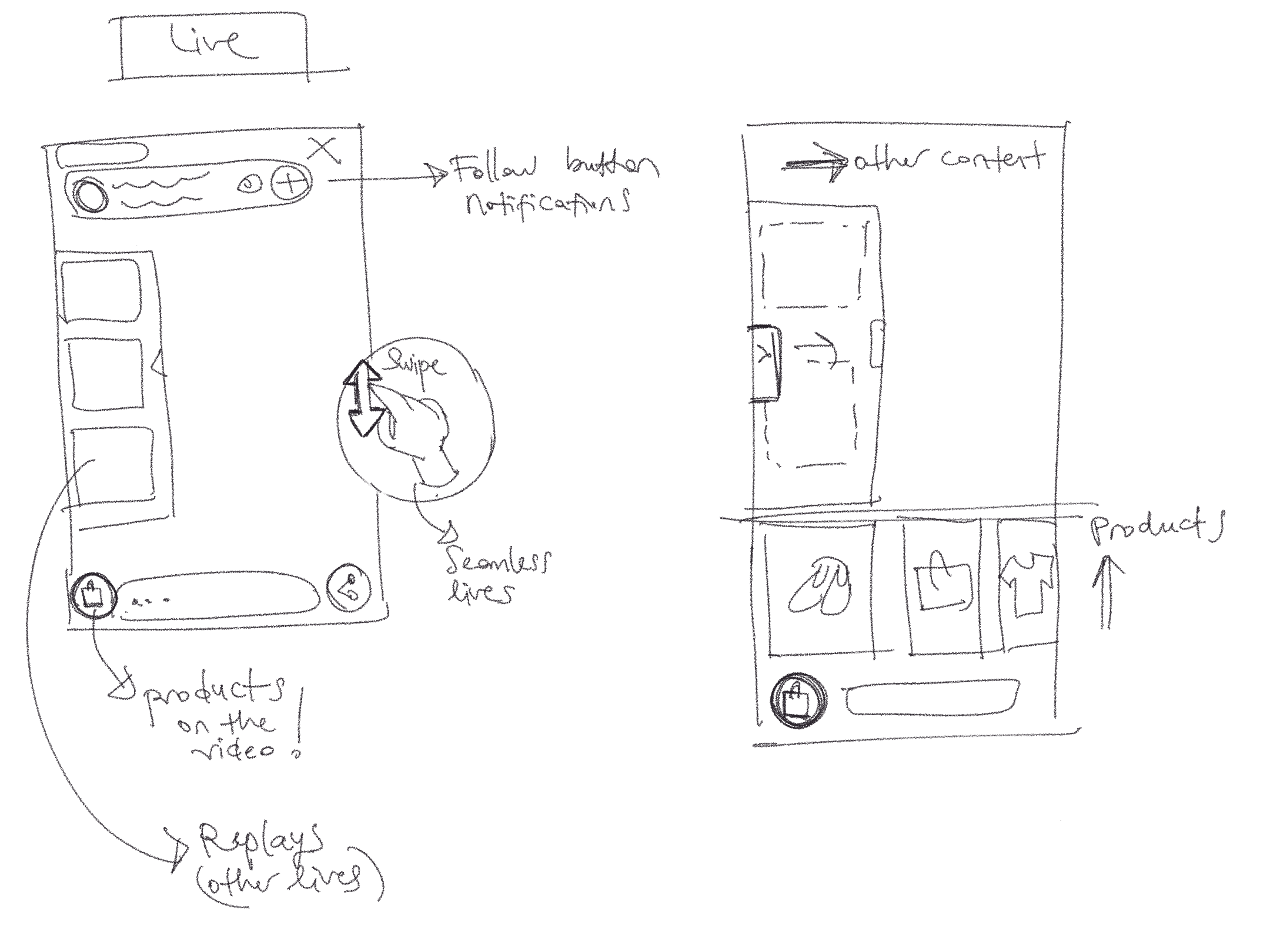
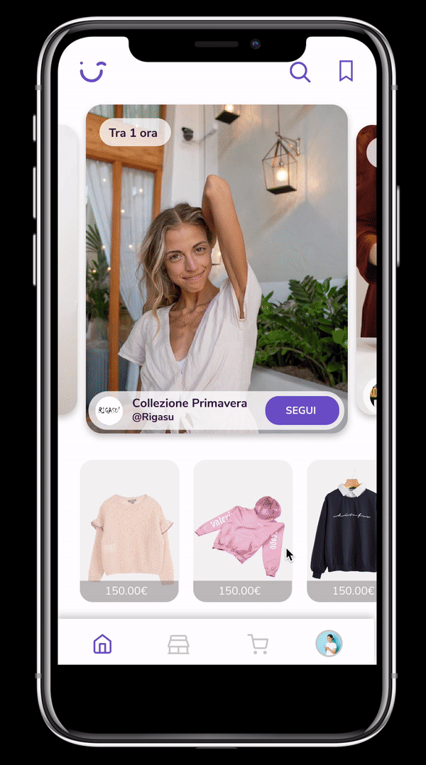
Live Streams & Replays
I have changed the icon for the product list on the live stream screen. I have added suggestions with emojis to the chat in order to encourage the user to join the chat.
With the new style of the product list, the user can browse through the products and at the same time can continue to watch the video. Also can browse through the other videos on app and change the live seamlessly.
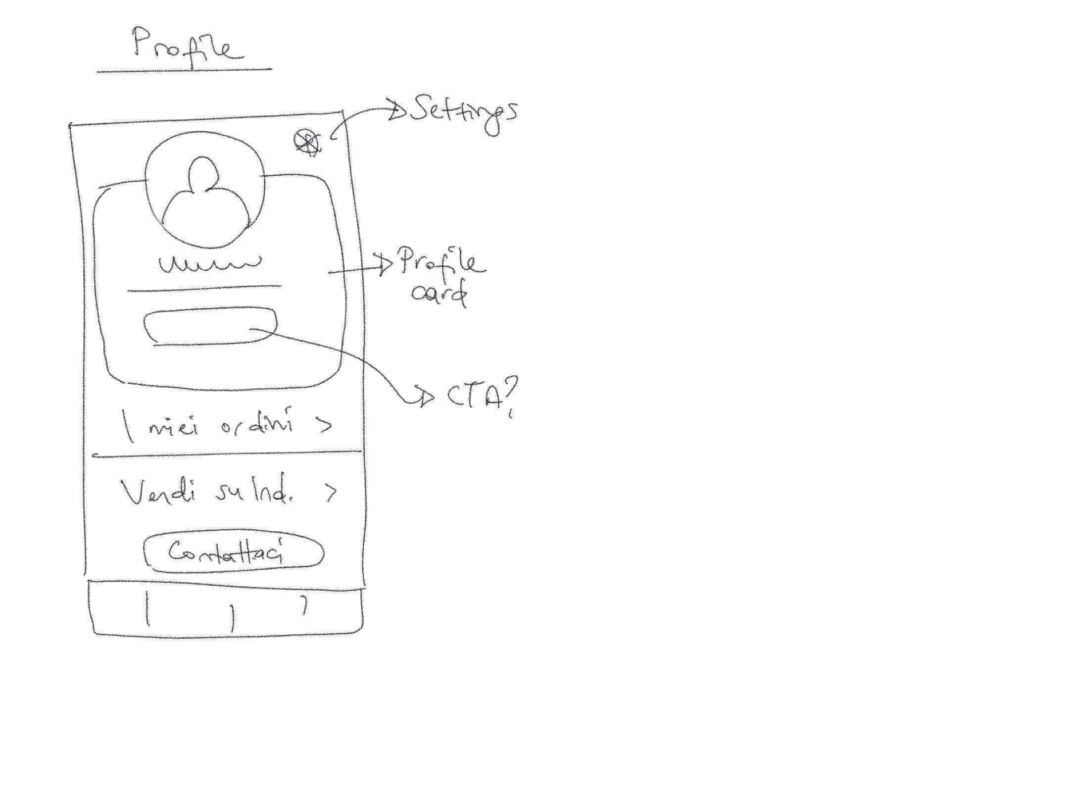
Wire-flow

High-Fi Wireframes
Web Design
I have created the web site on WordPress with Elementor.
Further enhancements can be done for the mobile version.
This project made me realize one more time that there are so many constraints to a startup such as budget, time and feasibility.
I would have continued this project with iterations, usability and validation testing to take it to another level.
Working on Indaco was incredibly rewarding.
I got to experiment with some of the new Figma features, and enhance my design process.